Purpose
How to Organize Your Portfolio
Storage Media
Preparing Your Portfolio
Purpose
A portfolio of your design projects will be one of the means by which the faculty will assess your performance during this subject as well as in the subsequent specialty area design subjects (1.031, 1.041, 1.051) and in the capstone design subject (1.013). By the time you get your degree, your portfolio will be a collection of all your projects showing your work and your development as a designer.
By documenting your projects during your studies at MIT, your portfolio will also serve as a means to document your professional qualifications, showing your undergraduate work and continuing with what you do later. Hence the portfolio should be continuously updated during your career.
In general a portfolio will communicate that one possesses some or all of the following: design experience, breadth of talent, ability to handle responsibility, organizational skill and creativity. The portfolio which you will develop during your 1-C studies has a more narrow focus; it will document the way you approach the design process, how you represent your ideas and how you implement your designs. You should feel free, however, to include other things reflecting your studies and/or related experience. Clearly, for later professional use, you need to structure the portfolio in a way which best represents your work.
In the following sections we are giving you some guidelines on the organization and preparation of your portfolio. We are also including instructions on the use of electronic media.
How to Organize Your Portfolio
As mentioned before, the portfolio should reflect the projects you did for the sequence of design subjects. The projects can be ordered according to several criteria such as scale, materials employed, tools used during design, chronology, etc. We do recommend however that whatever criteria you choose to organize the order of your projects should be made clear to the reviewer.
As well as the general organization of your portfolio, each project should also be organized in a way that reflects three stages that will be present in most of your projects: the problem statement, your solution to that problem and the implementation of your solution. Another way to look at this division could be as their by-products: generation, representation and follow through. The degree to which these stages will be present in each project will change from one to another. For example, smaller projects in general will tend to be more developed in terms of implementation than large scale projects.
The ideas for each stage can be transmitted graphically as well as through text and complemented with technical data. The strong points of each design should be made clear and highlighted to whoever may review your portfolio later on.
To help you think about how to organize your work, you should assume that the person who will review your portfolio would not be familiar with your work beforehand. Your portfolio materials should include a brief description of each item, for example label your images, clear titles for each text, section, etc. You might want to include general introductory information such as when you developed it, for which class, and using what tool(s). It is particularly important to put the project in context if the person reviewing your portfolio isn't familiar with your projects.
The following items are only suggestions that may help you as a guide but you are not limited to the following checklist. You are encouraged to find other items you think should be included that better represent your work. Also many of the points listed below are not applicable to all projects, you should decide which are useful to best explain each project and which ones aren’t.
-
Generation: Problem Statement
- Statement of the Design Problem
- Explain How You Developed Concepts for Your Design
- Rough Drafts
-
Representation: Design/Problem Solution
- Explain Why You Designed the Particular Project or Component in a Certain Way
- Sketches
- Plans
- Photographs
- Analytical Solutions
- Details (Drawings, Optimization Spreadsheets in Appendix, etc)
-
Follow Through: Implementation
- Show How You Prototyped and Tested Concepts for Your Design
- Budget and Costs Breakdown
- Mock-ups/Simulations/Other Implementations
Your portfolio shouldn't be an assembly of all the work you did for each assignment. The portfolio assignments that will be included in each design task will be in great part a job of choosing from your records what you want to show. You will need to find which are the most important aspects of the problem, your design and the solution. Your work will be for the most part on reviewing the work you have done and selecting the elements that best represent the ideas you want to convey. For example, you do not want to show all the analyses you did for a particular job but only the most relevant technical data.
In general, we suggest that you include technical data and complementary information in the back as an appendix for further reference. This way the data will show the level of detail for the particular project such as structural calculations, drainage solution, specifications, etc, without interrupting the continuity in the exposition of the projects. This is general advice; the highlights of a particular project may require the use of other strategies to complement an appendix, or maybe all the technical information can be incorporated into the main body of the project overview.
Because your portfolio will include most of your work some projects may be stronger. You have to consider that your portfolio serves at least two purposes, initially to support the academic assessment of your work at MIT and eventually as a record of your professional qualifications. For the former a reasonably complete record is required while in the latter you want to emphasize your strengths. For this reason, we suggest that you keep your portfolio in a flexible format that will allow you to edit the projects. Keep in mind that, in general, a professional portfolio should include as much variety as possible.
The issue of flexibility brings us to the next subject which is what media would be best for you to store your work.
Storage Media
The work required to assemble a portfolio can be divided into 6 steps:
- Record-keeping
- Capturing Information
- File Storage
- Organizing Text, Data and Images
- Printing
- Web Publishing (Optional)
1. Recored-Keeping
Work on a portfolio starts long before the cut-and-paste stage. Keeping a record of what you've done, even if it's not your best work, is essential for illustrating your capabilities. Spend some time arranging the original drawings, large scale plans, hand sketches, deciding which files you want to keep on a disk, etc. This fist step is basically an archival job; all you need to do is decide what is worth keeping for your records while you're working on the design task.
2. Capturing Information
Once you have made a first cut of what drawings, models and files you want to save for later, you are ready to start recording it into a more convenient format. For example there might be a model or a large-scale plan that you want to keep, but the model might break or the size of the drawings might not be very convenient to store. Then you should probably scan, photograph or reduce your work to fit a common format, one that allows flexibility and the ability to add and subtract work. A good storage option for your work is in digital form. This handout explains how to scan images, take pictures with a digital camera and make screen shots of your CAD images to start keeping a record of your work. It's a good idea to do tasks one and two in parallel with the design assignment.
3. File Storage
By keeping the raw digital files of your work (pictures of models, CAD files, text, spreadsheets, etc) you can easily reformat, rearrange and reproduce as needed. Once you have the digital files of your work you can store them on a zip drive and work on them on any computer later on. The recommended formats to store your images so that they can be opened by most image-processing packages are explained in the second part of this handout.
4. Organizing Text, Data and Images
After each design exercise you will be required to put together a chapter of your portfolio. Since you already have started recording most your work and you probably have more than what you need to show, at this point you will need to make a second cut. According to what was discussed previously about how to organize your portfolio, you will need to decide which ideas you want to emphasize for your project and which files will allow you to do that. After this final selection it’s just a matter of text, data and image layout. For the layout we also provide simple instructions in the second part of this handout on how to accomplish this using PageMaker®.
At the end of the semester, once you have turned in the last chapter for your portfolio you will be ready to burn a CD-ROM of your work. However, if your portfolio is on Zip or CD-ROM, make sure that anyone who reviews it afterwards has simple instructions on how to install/view it.
5. Printing
For each assignment you should turn in prints, either 8 ½" x 11" or 11" x 17". At the end of the semester the portfolio materials you turned in for each assignment will be assembled into an 8 ½" x 11" or 11" x 17" binder. These standard formats allow you to easily make copies from most computer printers later on as you add new projects.
6. Web Publishing (Optional)
Putting your portfolio online is optional, but once you have finished the layout on PageMaker® it’s very little extra work.
Preparing Your Portfolio
We recommend you begin compiling a portfolio early in the semester and to continue throughout your academic career, keeping a record of what you've done will be essential once you reach the capstone design subject.
- Recording Information
- File Storage
- Organizing your portfolio
Keep the Following in Mind as You Create Your Portfolio
Organize your portfolio either chronologically, by topic, by media, etc., but make its organization self-explanatory so it can be reviewed without edification. Chronological sequence, for example, allows seeing the evolution of an individual’s skills.
Organize, organize. Diverse projects, work examples and presentation techniques can be handsomely displayed and unified by simple graphic techniques like borders, titles or gridded format.
Keep your portfolio lean. Only your best work and those in which you’ve had the most significant responsibility should appear. Reams of work do not impress.
Apply quality control to the graphic presentation of your work. The portfolio should read like a well-edited art book. The graphic layout of a portfolio can be important indicators of design ability and organizational skills.
Final professional photos are not enough. You must show what you did on the project and the thought process you used to get there by including information of the design process. The idea is to illustrate the unique process you use in evolving a design and to show how you communicate graphically final presentations as well as design ideas with your teammates during the conceptual phase.
Things you should never include in your portfolio. Full-size sets of construction drawings, full size originals of school projects or presentation drawings, complete specs, models or slides.
Don’t show work you did not do. Did you have sole responsibility, or was it a collaboration between you and others? If you include work done by a team, specify what you did and demonstrate that you understand how your contribution fit into the project as a whole.
The format you select may be informal or very well defined. It may consist of one or several consistent features such as:
- Lettering Style
- Borders
- Section Title Pages
- Consistent Use of Color
- Use of Grid for Layout
- Uniform Title an Symbols
There are numerous organizing features but not every portfolio will or should include all of them. Use enough features to hold the portfolio together graphically, allowing emphasis on the contents and flexibility.
Orientation. Before you decide on portfolio size, think about a consistent orientation for your drawings. Nothing is more frustrating than turning and twisting every which way to see what is in the portfolio. All drawings should read from the bottom or from the right. If you have to change orientation, do it at a logical breakpoint, such as when a new problem is introduced.
Double Leaf Image. In composing the portfolio, remember that the basic module for composing a layout is two leaves of the binder. The more complete the information on this double leaf spread, the easier it is to hold the viewer's attention. Try to put all related information on one double-leaf spread.
Consistent Signals. Try to set up a hierarchy, i.e., all title pages of a certain composition with the same size type. Use color strips or full pages as "flags" to indicate when you are beginning a new problem or section of the portfolio.
How to Scan Images
1. In order to start scanning your images into the computer you must first make sure the scanner is on and that Photoshop is open. You can find Photoshop in the Applications folder on the desktop of the Mac.
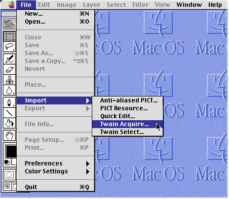
2. Once Photoshop is running choose File -> Import -> Twain Acquire from the menu.
3. Next, a dialog box will appear to start scanning your images. Once you have your document in the scanner facing down, make sure that the following settings are correct:
3.1. Document Source: Flatbed
3.2. Image Type: Color Photo (if scanning colors)
3.3. Destination: General
3.4. Resolution: 72 or 150 or more (depending if it’s for WWW or printing)
3.5. Scale: 100%
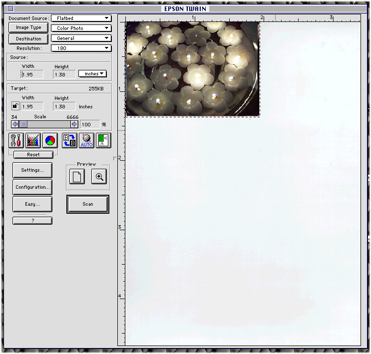
4. Now you are ready to start scanning:
4.1. Click on Preview.
4.2. Click on Auto
4.3. Choose the area of the window you wish to scan
4.4. Click on Scan
How to Make A Screen Shot from Microstation® into a JPG file In 4 Easy Steps
1. Open Microstation®, open a file, and orient the assembly into an interesting pose.
2. Next, under the menu bar select Utilities -> Image -> Capture:
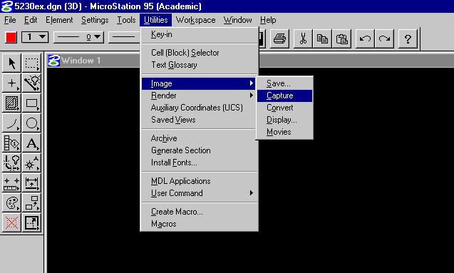
3. Now a window will pop up with a button titled Capture Screen which enables you make the screen shots:
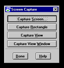
4. Once you clicked on Capture Screen a window will show up asking you to specify the name of the image file, the destination drive, compression and mode:
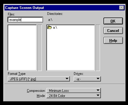
That's it! Note that this will create an image at screen resolution, which is nominally 72 dpi. That is great for the WWW, as that is as good as screens are, and so the file will download quickly. However, for printing purposes, 72 dpi is not so great. Most printers are 600 dpi or better, and so the screen dumped images will not look good.
To get around this, many applications now come with JPG or GIF image exporters. If so, you can use these for higher resolution.
How to download pictures from the digital camera
1. The software to download the pictures from the digital camera is called PhotoEnhancer for Kodak and you will find it under CEEMAC-252-1/2 -> Other Applications -> PhotoEnhancer for Kodak f.
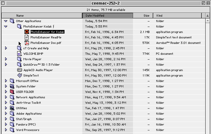
2. Next, the camera must be connected to the printer port of the computer and turned on.
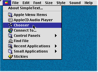
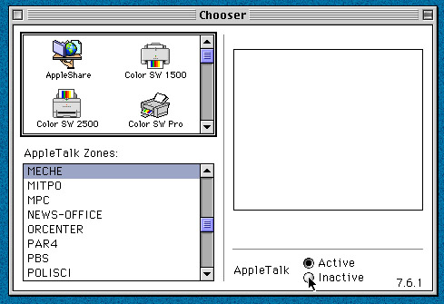
Make sure that AppleTalk is turned off before you continue. To turn AppleTalk off go to Apple->Chooser.
3. A dialog box will appear and you have to click on Inactive.
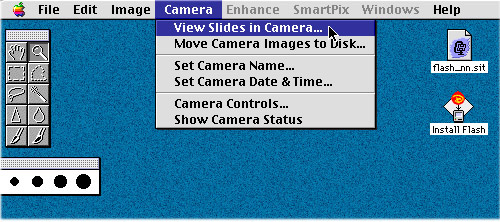
3. Once the software is open, you can view pictures from the camera by choosing Camera -> View Slides from Camera from the menu, to display the pictures currently in the camera as slides.
4. A dialog box appears so you can select to view the pictures stored on the camera and the range of pictures that you would like to open. For example, you may want to select the last 5 pictures out of 26. Click the From option and type 21 to 26 in the text edit box to open only those pictures.
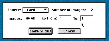
5. Once you have decided which pictures to save on disk, click once on the picture you want to save or hold the shift key and click to save multiple pictures at one time.
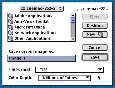
6. Choose from the menu File-> Save As. The Save As dialog box appears. Locate the folder and drive where you want to save your picture. When saving a single picture enter a new file name if desired. Choose JPEG or TIFF under File Format and click save.
How to use the SGI cameras
Every SGI has a camera on top of the monitor that you can use to take pictures of your projects.
To use an SGI camera type in the xterm window:
capture
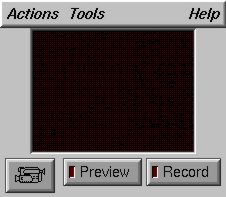
2. A camera window will show up, set the bottom left button to camera icon (instead of a mike or video).
From the menu bar select: Actions -> Setting, and a dialog box will show up. Some suggestions for setting everything up:
2.1. Frame Size: Full Size
2.2. Crop Area: 640x480
2.3. Click on Fixed Aspect Ratio
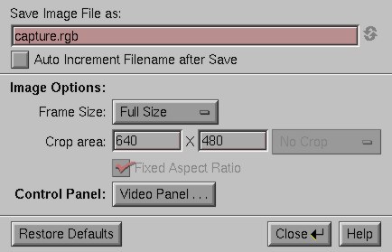
2.4. Click on Close once you are done
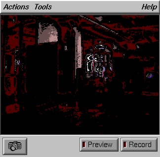
3. Clicking the record button will make a RGB file in your home directory.
To convert the RGB file into GIF or JPG format you can use XV, open the image and save it in GIF format.
add graphics
xv capture.rgb
Photographing Your Work
- If you plan on using natural light, eliminate glare by shooting in the shade or on an overcast day.
- For interior shots, position your work next to a window, at a 90-degree angle. There should be no other lights on in the room.
- Photograph each piece individually.
- Fill the camera frame with your work. Avoid including extraneous objects (e.g., fingers, legs, and furniture) in front of the image.
- Don't worry too much about the background. If your work is framed well in the shot, you can go back and mask the background out.
- Remember: Not every shot will be "good." So make lots of them so you have plenty of options.
- Take your time. Don't wait until the last minute. Re-shoot if necessary.
For my images, should I use TIF format, JPEG format or GIF format?
Here is the difference between these formats:
Format | Capable colors | File size | Loading time | Quality |
GIF |
256 colors (8 bit) | Small | Fast | Low |
TIF |
Millions (24 bit) | Large | Slow | High |
JPG |
Millions (24 bit) | Up-to-you | Up-to-you | Up-to-you |
In general, GIF images are smaller and lower quality than TIF. With JPG images, you can choose quality over file size, or file size over quality, but some color information of the image gets lost.
When you make these images, remember that you can go from TIF to GIF/JPG, but you should not go from JPG/GIF to TIF. The reason is that some information in your original 24 bit color TIF image is lost in JPG/GIF format. In other words, once the image is converted from 24 bit TIF image to 8-bit GIF format, you can never recover the quality even if you switch the format back to TIF.
Organizing Your Portfolio
Getting started
First you will need to start Pagemaker® by double clicking on the icon on the desktop of your computer.
Once Pagemaker® is open you are ready to start building your portfolio:
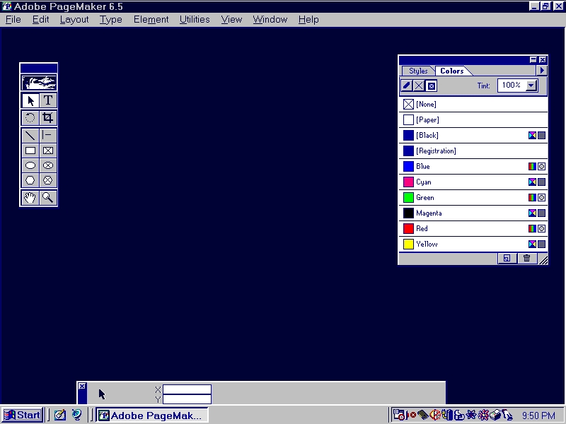
Setting up pages
To start you need to choose File -> New to begin a new file, the Document Setup dialog box appears. You can define the basic parameters of your portfolio, such as page size, orientation, margins, and the number of sides on which you print.
To set up your portfolio:
1. After starting PageMaker®, choose File -> New.
2. Specify page size and page attributes in the Document Setup dialog box as follows:
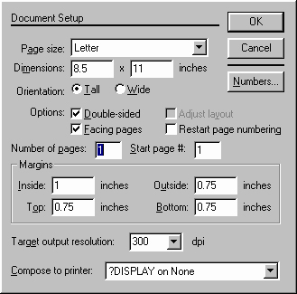
- Select a standard page size from the Page Size pop-up menu.
- Use the Dimensions text boxes to specify a custom page size.
- For Orientation, select Tall for a page that is taller than wide (Portrait orientation), or select Wide for a page that is wider than tall (Landscape orientation).
- Click Double-sided to set Inside and Outside margins to accommodate binding on pages that will be printed on two sides and to make the Facing Pages option available. Deselect Double-sided if you intend to print your portfolio on one side of the paper (single-sided) and don't want to turn on Facing Pages.
- Click Facing Pages if you want left and right pages displayed together (as a two-page spread) and you have selected Double-sided.
3. Enter the Number of Pages you initially plan for your portfolio. (You can add or delete pages later if necessary.)
Screen Layout
Your screen now should look something like this:
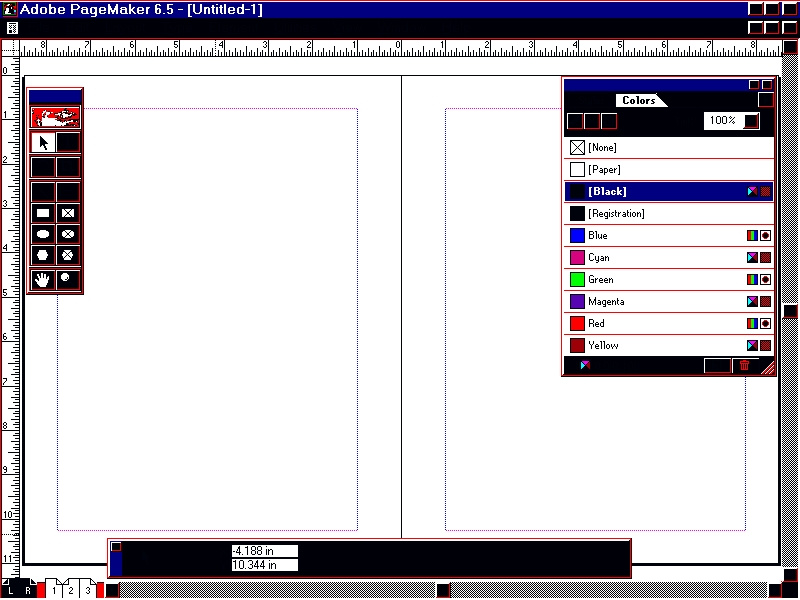
Changing Document Setup options after you started
Although the Document Setup dialog appears when you choose File -> New to create a portfolio from scratch, you can modify a portfolio's Document Setup at any point in your work by choosing File -> Document Setup while the portfolio is active.
Toolbox Palette
Choose Window -> Show Tools or Window -> Hide Tools to display or hide the toolbox.

Pointer Tool: To select , move and resize text blocks and graphics. | Text Tool: To type, select and edit text |
Rotating Tool: To select and rotate objects | Cropping Tool: To trim imported graphics. |
Line Tool: To draw straight lines in any direction. | Constrained Line Tool: To draw straight lines in the horizontal or vertical direction. |
Rectangle Tool: To draw squares or rectangles | Rectangle Frame Tool: To create a rectangular placeholder for text or graphics. |
Ellipse Tool: To draw ellipes and circles. | Ellipse Frame Tool: To create a circular or oval placeholder for text and graphics. |
Polygon Tool: To draw basic polygons. | Polygon Frame Tool: To create a polygonal placeholder for text and graphics. |
Hand Tool: To scroll the page or to preview. | Zoom Tool: To magnify or reduce an area of the page. |
Formatting your portfolio with master pages
Master pages can save time and ensure consistency across pages in your portfolio.
- Position nonprinting guides on the master pages to help you place text and graphics accurately and consistently throughout your portfolio.
- Create basic design elements on the master pages, including graphics or text that you want to appear on each page in your portfolio.
- Add headers or footers to master pages.
To format the master pages double click on the master pages which are on the lower left corner of your screen:
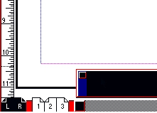
Graphics and Text Objects: Using frames
Frames in Pagemaker® have two important functions for us:
- A frame can hold content, either text or graphics.
- One text frame can be threaded to other text frames so that a single text can flow through multiple frames.
Taking advantage of frames
By drawing empty frames as placeholders and threading text frames together, you create a template in which the layout and structure of the portfolio is set and content is easily poured into assigned spaces.
Creating a frame
To create a frame you use the frame tools in the toolbox. You can also turn any object you've created with the drawing tools (with the exception of straight lines) into a frame. If you add a frame to a master page, its border and content appears on each portfolio page to which the master is applied.
To turn a basic shape into a frame:
1. Create or select a PageMaker®-drawn shape.
2. Choose Element -> Change to Frame.
Note: If you don't want a border around the frame, select the frame, and choose Element > Stroke > None. A non-printing, light-gray border appears around the frame.
Adding content to a frame
You can fill frames with text or imported images. You can also type directly into a frame to start a new text or to edit an existing one. A frame becomes a text frame or a graphics frame depending on the content you add.
To import text or graphics into a frame:
1. Select the frame.
2. Choose File -> Place.
3. Select the file you want to place, select the Place Within Frame option along with other place options, and then click OK.
To type into a frame:
1. Click the text tool.
2. Click in an empty frame or in a frame containing text and start typing.
To delete content from a frame:
1. Select a frame.
2. Choose Element -> Frame -> Delete Content.
Adding and deleting pages.
You can add or delete pages as follows:
- If you choose File -> Document Setup to alter the number of pages, the program adds or deletes pages from the end of the portfolio
- If you choose Layout -> Insert Pages or Layout -> Remove Pages, you can add or remove pages anywhere in your portfolio.
To add pages anywhere in your portfolio:
1. Go to the place where you want to insert pages.
2. Choose Layout -> Insert Pages.
3. Type the number of pages you want to add, and select a location for the new pages.
4. Specify the master pages you want to apply, and then click Insert.
To remove pages:
1 Choose Layout -> Remove Pages.
Type the range of pages you want to remove, and then click OK.
Printing Your Portfolio
To print using the default settings:
1. Choose File -> Print.
2. Select the Document printing options you want.
3. Click Setup to set additional printing options.
4. Click Print.
The Print Document dialog box:
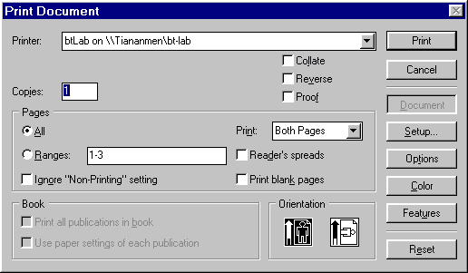
When you choose File -> Print, the printing dialog boxes shows up for the type of printer you selected.
- Click Print to print your portfolio.
- Click Document to display the Print Document options again.
- Click Paper, Options, Color to view other printing options for PostScript printers.
- Click Features to view printer-specific features for PostScript printers.
- Click Setup, Options, or Color to view other printing options for non-PostScript printers.
- Click Reset to change the printing options in a dialog box back to their original settings.
Posting Your Portfolio on the Web
Distributing your Portfolio Electronically
PageMaker® can export into two online formats:
- PDF (Portable Document Format) which can be viewed and printed from several different platforms with the page layout and typography of the original document.
- HTML (HyperText Markup Language) which is the standard used on the World Wide Web.
Preparing your portfolio for HTML
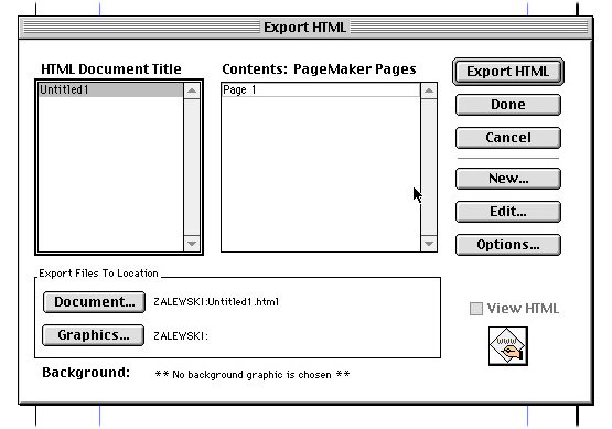
To convert your portfolio into an HTML file:
1. Choose File -> Export -> HTML.
2. In the HTML Export dialog box, click New.
3. Enter a document title (the title will display at the top of the browser window when the document is viewed).
4. Select Assign PageMaker® Pages if you want to define a page or range of pages to be exported as HTML .
5. Select an unassigned page to be exported into the HTML document you are defining, and click Add.
You can click View with a page number selected if you want to display the page.
6 If you want to apply a tiled background image for the document, click Background and then double-click the GIF or JPEG image you want to use as a page background.
To export pages with a page background color rather than an image, return to the PageMaker® window, and edit the PageMaker® color [Paper] to the background color you want to appear in the HTML page.
7. Click Done to save the changes made so far and return to the HTML Export dialog box.
8. Click Document, and select Save Images into This Folder if you want your HTML document to include images from your portfolio and you want to store them in the same folder as the HTML document
9. Click OK.
10. To generate the HTML, click Export HTML.
The next step in the process is to make sure that the PageMaker® document is HTML compatible. The first time you save your portfolio as HTML, the program checks it for HTML compatibility. If the portfolio contains an element or layout attribute that is not supported by HTML, the program presents a dialog box informing you of the parts of your portfolio that need to be changed.
Setting up your www directory
1. Once you have collected all your HTML files on a disk, create a www/portfolio directory on your account:
mkdir ~/www/portfolio
2. Make that directory readable to anyone:
fs sa ~/www/portfolio system: anyuser read
3. Copy your HTML files from your disk to your www directory. Type in your Xterm window:
add mtools
mcopy a: ~/www/portfolio
4. Set the permissions for each file to readable:
chmod o+r filename
Replace username with your complete username. Ask a friend to look at your portfolio from his/her account to make sure that the page is world-readable.
Note: If you have lots of images to show on a single web page the best way to do it is using a set up similar to the one explained below. There are many examples of this on the web.
1. Use a small thumbnail preview in your page in GIF or low-quality JPG format. This will load fast even if you have many in-line images on a same page. The quality of each image suffers but it is used only for preview purposes.
2. Use a few full-size, full-color images in TIF format or high-quality JPG linked from your thumbnail previews in separate pages. These will take a bit more time to load but will give you a much better image quality.
